

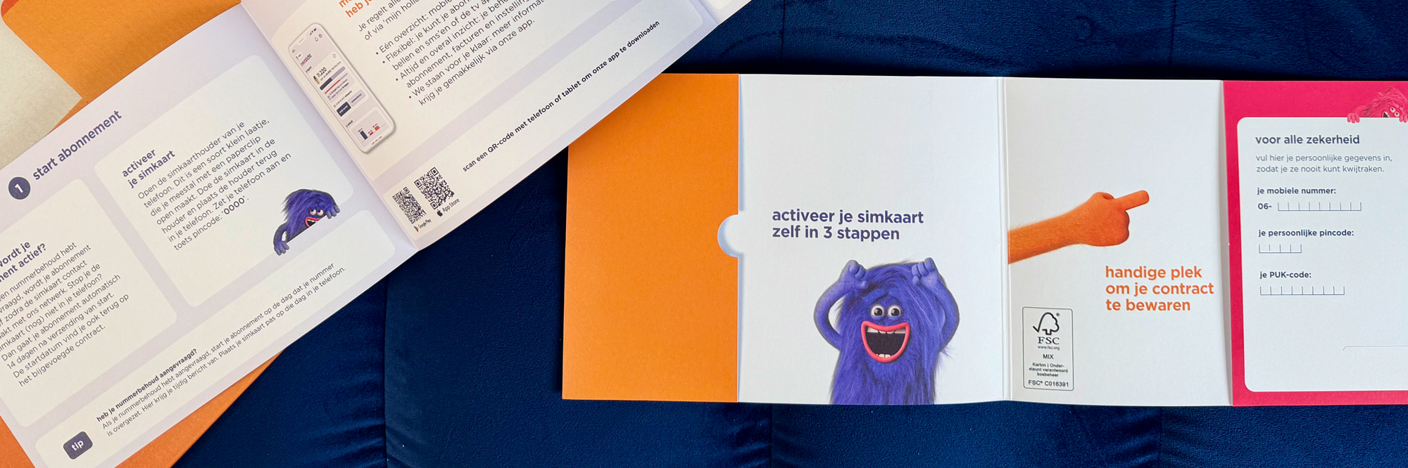
In 2026, hollandsnieuwe renewed its brand identity. The vibrant new colors looked fantastic on screen, but when it came to print, reality introduced a challenge.
Several colors simply could not be reproduced accurately using standard printing processes. Bridging the gap between digital design and physical production required a deeper understanding of both color management and production capabilities.
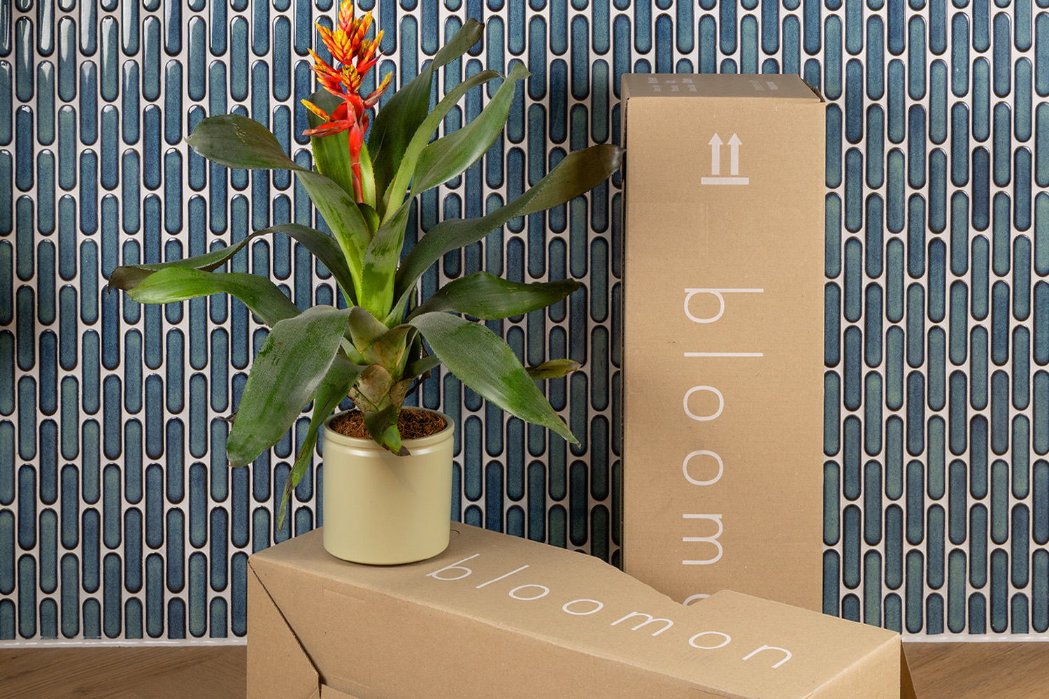
To make the challenge even greater, the colors needed to remain consistent across a wide range of substrates and printing processes. From direct print on brown corrugated mailer boxes to uncoated, extra-bright offset paper, each material responded differently to ink and color.



"I remember walking in for a quick meeting that ended up becoming a full color management crash course. Bringing together different areas of expertise and learning from each other is one of the things I enjoy most about this job."
Oscar de Haan
Paxpring
Together with hollandsnieuwe, its brand agency and our production partners, we embarked on an extensive process of print trials, color swatches, artwork refinements and production checks.
Through close collaboration and continuous testing, we gradually narrowed the gap between the digital brand identity and what could realistically be achieved in print.
The result was more than a successful print implementation; it established a new standard that is now embedded in the hollandsnieuwe brand identity.

bloomon
Plant delivery
Other

Consumer electronics manufacturer
Service Parts
Consumer electronics
Telecom products

B!pod
Consumer electronics
Other